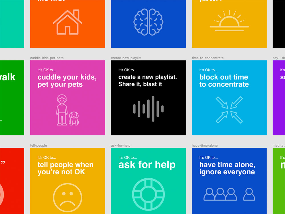
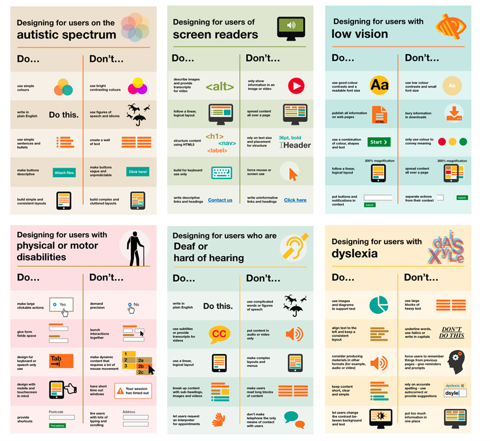
These are strange, and scary, times we’re living in. We’re in the midst of an unprecedented global health crisis in the form of COVID-19, and right now we’re all just trying to find our way and make sense of it all, both in our personal lives and our working lives.
I was inspired by this post by the lovely folks at Co-op Digital, so I took some of their words (without asking, hopefully they won’t mind!) and made some posters/cards for anybody that might find them useful or helpful. It also provided a nice distraction for me, for a few hours! You can download the full set here.
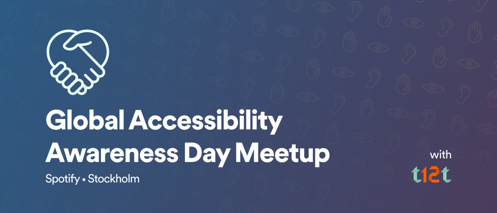
This year’s GAAD (Global Accessibility Awareness Day) took place on Thursday 16th May, and to mark the event I went over to Spotify’s “Urban Escape” headquarters in Stockholm, where Spotify’s Design team were hosting a meet-up organised by the t12t group.
The event was an opportunity for like-minded folks to get together, and discuss how digital accessibility affects them or how they tackle it. There were a number of talks (a series of short ‘lightning talks’ plus one keynote) given by a variety of speakers.
Lightning Talks
First up were Shaun Bent and Phil Strain, from the Spotify Design team. They spoke about how they promote and accessibility best practices at Spotify via an Accessibility Guild; a cross-team collective of subject matter experts and advocates. Shaun also spoke about specific accessibility issues within the Spotify UI, such as the use of colour alone to indicate a changed or active state, which doesn’t help users with colour blindness. Their solution was to add a simple dot to the relevant icon, to indicate the changed or active state, as seen below. The positive feedback they have received from colour blind users shows what a big difference such a simple change can make.
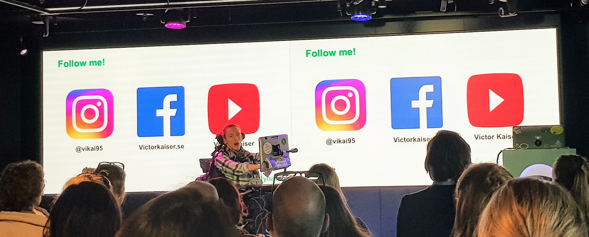
Victor Kaiser is a 23-year old Stockholm native who has suffered from Cerebral Palsy since he was four months old. He works for Tobii Dynavox, a Swedish company specialising in assistive technology for communication. Victor spoke about how their products have helped him, and what a difference they have made in how he communicates and interacts with others.
He also gave some advice on how to design/build digital content for users of eye tracking software, or eye gaze devices. Unlike users with mobility issues that might rely on switch devices to navigate web pages, eye gaze devices (and eye tracking software) track the user’s eye movement and direction, so for example a link could be selected by the user resting their gaze on it. This means that any interactive elements should have plenty of space around them, to make it easier to target them visually.
Keynote
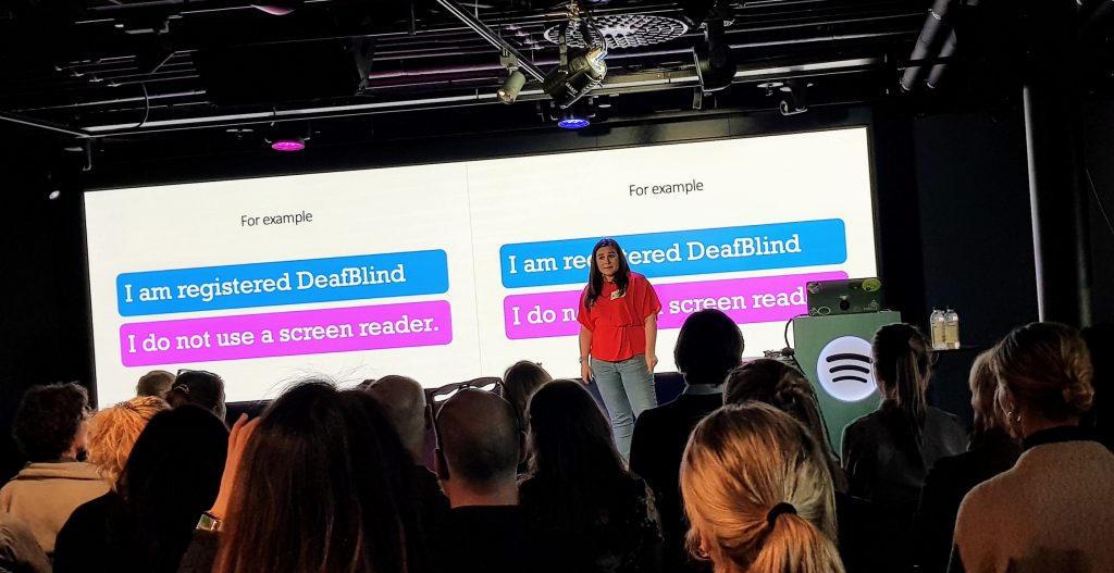
Following talks on “Designing for neurodiversity” by Sara Lerén, and “Really accessible low hanging fruits” by Daniel Göransson, came the keynote, from Molly Watt. Molly has Usher Syndrome, a condition that causes both Deafness and blindness, and her talk covered a variety of issues stemming from her own experiences. Like Victor earlier in the evening, Molly sang the praises of assistive technology, particularly hearing aids, and what a profound difference the latest ‘smart hearing’ technology has made to her life.
Molly also spoke about challenging misconceptions when addressing digital accessibility. She suggested (while not wanting to be in any way negative about sets of guidelines such as WCAG) that, when it comes to making digital content accessible, checklists don’t necessarily work. She used the example of her own accessibility needs and how, as somebody who is registered DeafBlind, she doesn’t use a screen reader. So while checklists are a good starting point, more effort could/should be made to speak to and test with users with different accessibility needs.
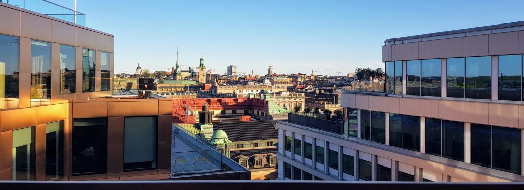
The meet-up ended with some networking, and a chance to enjoy the views from the rooftop balcony on what turned out to be a beautifully sunny evening in Stockholm.
Accessibility Club (or a11yclub) is a regular meetup held in Berlin about all things web accessibility and assistive technology. Today they held their first all-day conference, at the beautiful Spreespeicher, next to the river Spree, looking onto the Oberbaumbrucke (bridge), in the Friedrichshain district.
The first speaker was Molly Watt, a prolific blogger and advocate of inclusive technology. Molly has Usher Syndrome, a condition that causes both Deafness and blindness, and although she has a wealth of knowledge of web accessibility and how it can be enabled, her talk was mainly around her personal experiences of travelling to events (such as today’s conference), and the many considerations that need to be factored in. If accommodation needs to be booked, the hotel needs to be contacted directly to ensure they are prepared for accommodating Molly’s Guide Dog. Molly also needs to check the route to the hotel/venue to ensure there are grassy areas for the Guide Dog. Travel arrangements also need to be planned carefully and thoroughly, although sometimes factors beyond Molly’s control can lead to major issues, such as when a trip overseas resulted in Molly’s Guide Dog being quarantined.
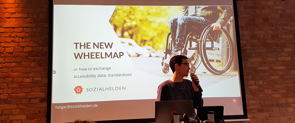
Next up was Holger Dieterich, who talked about his company’s work on Wheelmap.org, an online map for finding wheelchair accessible places. Thanks to around 70 volunteers, working in 25 different languages, almost 1 million public places around the world have now been ranked in terms of their accessibility. He also spoke about accessibility.cloud, a free-of-charge API (currently in closed beta) providing access to standardised location-based accessibility data.
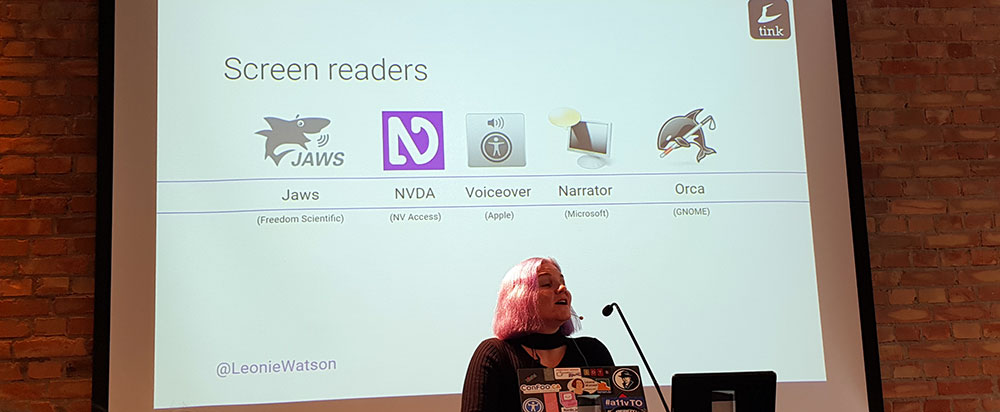
Leonie Watson gave a technical talk on the subject of web page performance, with a specific focus on assistive technology such as screen readers. She went into detail on the technical factors that can affect performance of different screen readers in particular browsers. The TTI (Time To Interaction) for screen reader users can vary greatly depending on how an operating system and web browser expose a page’s content to a screen reader; more detail can be found in Leonie’s slide deck, which she has made available here.
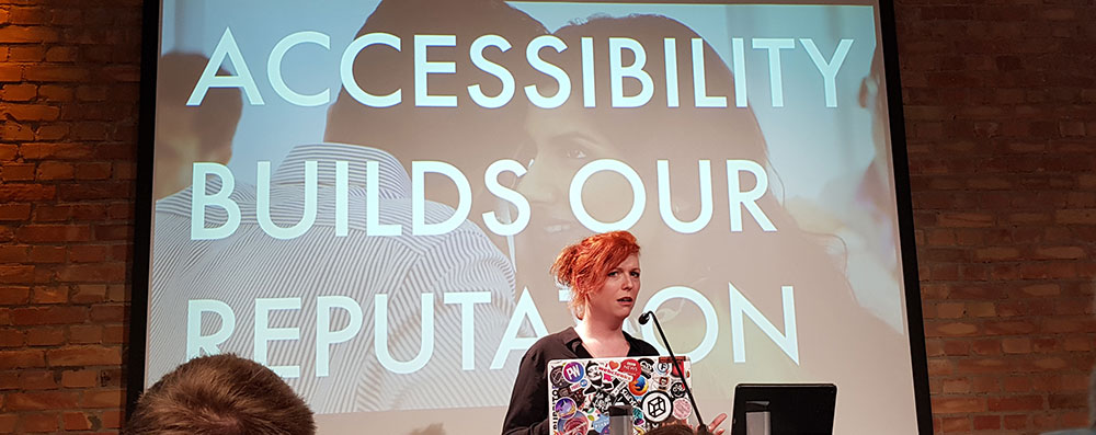
Charlie Owen gave an incredibly passionate talk about the issues that might be faced when advocating accessibility in a large organisation, and also very robust arguments in favour of making accessibility a core element of every project. The moral/ethical reasons for making web content accessible to all are not the only reasons. There are other, more commercial factors that should be highlighted, such as contractual obligations (perhaps as part of a Service Level Agreement) as well as legal obligations for certain kinds of organisations (such as Section 508 of the Rehabilitation Act of 1973 in the USA).
Last speaker of the day was Alistair Duggin, Head of Accessibility at Government Digital Service, responsible for making sure that GOV.UK is as accessible as possible. He spoke about his 4-part strategy for making digital products accessible, revolving around these four core principles;
Design for ease of use
Design for easy adaptation
Design complementary alternatives
Design to work with assistive technology
Amongst the many observations he made about the accessibility work that’s been done at GDS over the last few years, one that I know from personal experience holds true is that baking in accessibility from the beginning of a project is much quicker and easier than having to retrofit or patch it in towards the end, as a release date is looming.
From the moment I first read about Beat Saber, I suspected it was going to be something I would love. Now that it’s finally available for Oculus Rift and I’ve spent some time with it, I can confirm that it’s every bit as good as I’d hoped.
Beat Saber is essentially a Virtual Reality rhythm game, although that description does little to convey what a ridiculously fun, engaging experience it is. The aim is to slash blocks, in time with music, with a pair of blades, within a highly stylised, neon-lit virtual environment.
The game’s developers describe Beat Saber as “a mashup of Guitar Hero and Fruit Ninja in VR”. The one factor they neglect to mention (presumably to try and avoid any legal wrangles with Lucasfilm) is that the pair of blades the player controls look uncannily like light sabers. Anyone with a passing interest in Star Wars will no doubt jump at the chance to wave around a pair of realistically rendered sabers while smashing cubes out of mid-air, and watching them shatter around you. The actual music featured in the game might be a bit more subjective, as the soundtrack consists entirely of loud, up tempo EDM. It’s the perfect soundtrack for the nature of the gameplay, but it might not be to everybody’s taste.
Beat Saber is without a doubt the most fun experience I’ve had in VR. It’s definitely a game that is perfectly suited to the medium. It’s just a shame that at this moment, the hardware required to run it (Beat Saber is currently available for Oculus Rift and HTV Vive, which in turn require a relatively powerful PC) makes it inaccessible to many gamers. However for anybody who does own one of those platforms, let’s be honest, the range of high quality VR experiences available right now is fairly limited. And with that in mind I really can’t recommend Beat Saber highly enough.
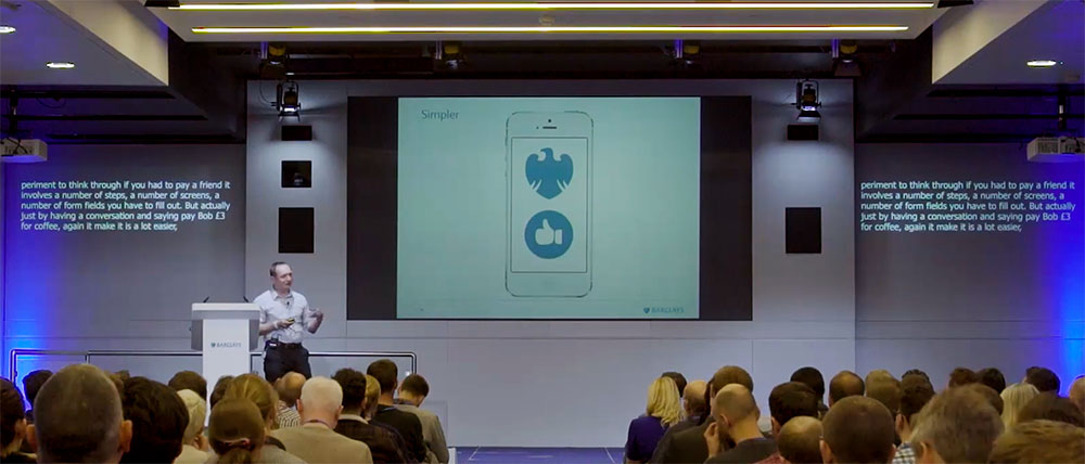
Over the years, since I started working on the web, I’ve been to various industry & tech conferences. They’ve varied in content; sometimes they’re very technically oriented and deal mostly with coding, sometimes they’re aimed at a more creative audience, or sometimes (like in the case of the TEDx program) they’re not aimed at anyone in particular but can be very inspiring all the same. Since I became more actively involved in Accessibility, conferences and meetups dealing exclusively with how to make the web more accessible have been hard to find, at least in North West England. One meetup group that’s existed for some time now is the London Accessibility Meetup. Since I’m currently working in London I thought it would be a great opportunity for me to get along to one of their meetups, so I went along to last night’s event at Barclays in Canary Wharf.
This was certainly the classiest web meetup I’ve been to so far! Barclays’ Canary Wharf HQ is huge, and pretty impressive, and the refreshments on offer were more in keeping with an expensive wedding – no cold pizza to be found here.
The first talk came from Paul Smyth, Head of Digital Accessibility at Barclays, who is himself visually impaired. Paul talked about how Barclays are approaching not just web accessibility, but accessibility to their services in general, including talk cash machines and high visibility debit cards for visually impaired customers.
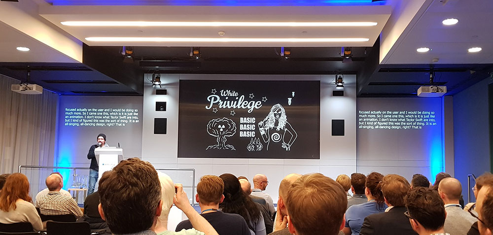
The second talk was from Heydon Pickering, an Accessibility Consultant with The Paciello Group and author of Inclusive Design Patterns. Heydon’s talk was on the theme of Priorities, and I think it would be fair to say that it was a fair bit more irreverent than Paul’s talk. He started by discussing taylorswift.com, and its complete lack of accessibility (due to, amongst other things, lazy/non-sensical use of JavaScript), and went on to cover other topics such as how many users actually care about features like subtle drop shadows around buttons – using a nice table comparing Feature to number of F*cks given…
Both talks were really informative, and although I got the impression a few folks in the audience found Heydon’s manner slightly offensive, I thought it was very refreshing and I’d happily listen to him talk again.
The next London Accessibility Meetup is scheduled for Monday 12th February. If you’re thinking of going along, I might see you there!
The latest chapter in the Star Wars saga has just been released, and naturally myself and my fellow geeks (aka my children) were at our local multiscreen for the opening night. This post isn’t a review as such, more a bit of a brain dump as these days, seeing a brand new Star Wars movie for the first time is always a bit of a strange experience for me. I grew up with the original trilogy and have seen episodes 4-6 so many times now that they hold no surprises for me whatsoever, so the prospect of brand new plot twists wrapped in such a familiar formula is always a bit… just… odd. It would be fair to say that The Last Jedi definitely has more plot twists than any other Star Wars movie so far.
I’m writing this the day after having seen The Last Jedi for the first time, and I’ve already spent more time this morning than is reasonable just thinking over everything that happened – at least the bits I could remember. It’s probably the most incident-packed SW movie, as well as the longest. That’s not necessarily a good thing; the second act did feel quite drawn out and there was definitely a good half hour in the middle where, if my phone had been turned on, I’d probably have been checking my email. But the first and third acts, wow… director Rian Johnson has succeeded in making a Star Wars movie that feels like a continuation of the saga that so many people know and love but at the same time makes brave, and exciting departures, from the well trodden formula. In a lot of ways it feels like the last part in a trilogy, rather than the middle, but I’m already looking forward to see how JJ Abrams will wrap things up in episode 9.
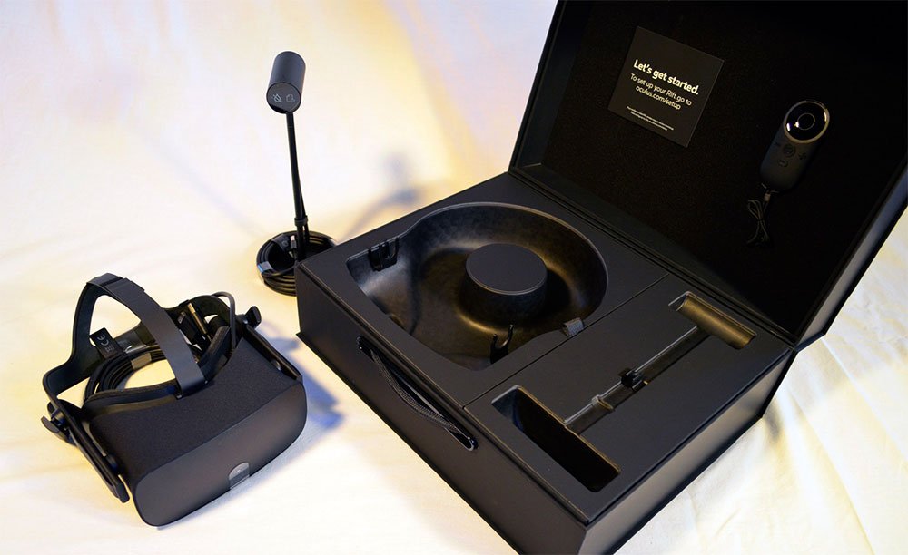
Oculus recently launched the Summer of Rift campaign, a season of special events and offers to promote their Rift headset and various third party software titles. For a limited time, the “Rift + Touch” bundle is on sale for $399/£399. The previous price was in the region of £700 for both the headset and touch controllers, so it seemed like a good opportunity for me to take a fairly major step up from my Cardboard viewer and GearVR.
First impressions were very good. The hardware is beautifully packaged, and really gives you the feeling that this is a premium product. Setting and calibrating the headset and sensors was a fairly painless experience – although in my case the space I’m using the Rift in is much smaller than the ‘Guardian’ software (a tool to prevent you bumping into/falling over real world objects when wearing the headset) would like, so I had to skip that part. Once the hardware is set up, the first VR experience you’re presented with is First Contact, which serves as an introduction to both the headset and touch controllers. The first time you look around, then realise that you can interact with your virtual environment via the touch controllers, it’s a pretty incredible experience.
So far during the time I’ve spent using the Oculus Rift, the most striking experiences have been just that – experiences – rather than traditional games or tools.
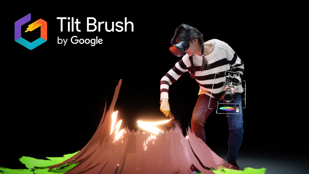
Google’s Tilt Brush is technically a painting tool, but for me there was a major wow factor in drawing streaks of light, stars and psychedelic flashing rainbows in a 3D space, and being able to move into and around the paintings as I was working. It’s also pretty mind-blowing seeing what slightly more talented (!) artists are coming up with using Tilt Brush.
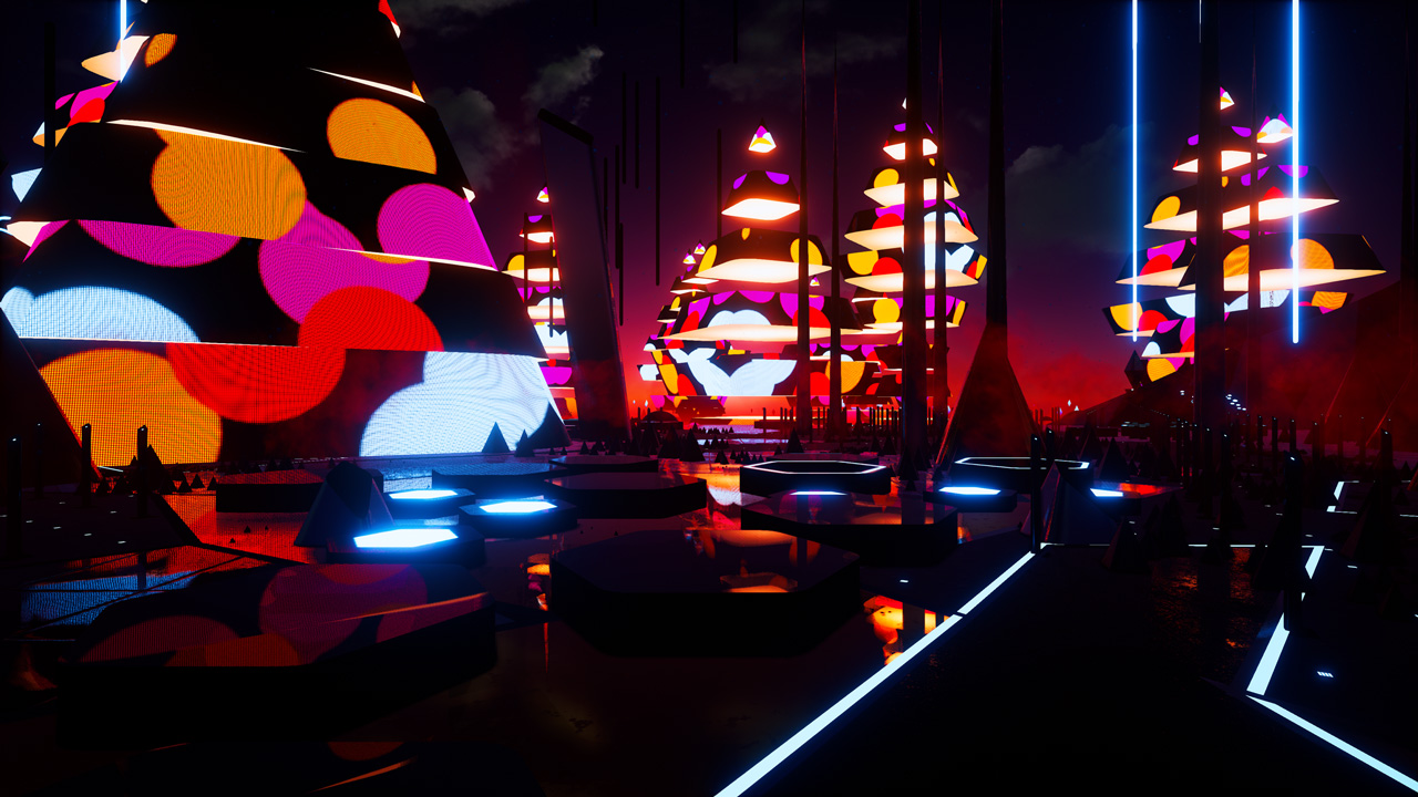
Fantasynth, by HelloEnjoy, is a stunning “audio-reactive experience” taking the user through a procedurally populated environment where the visuals and geometry synchronise with music.
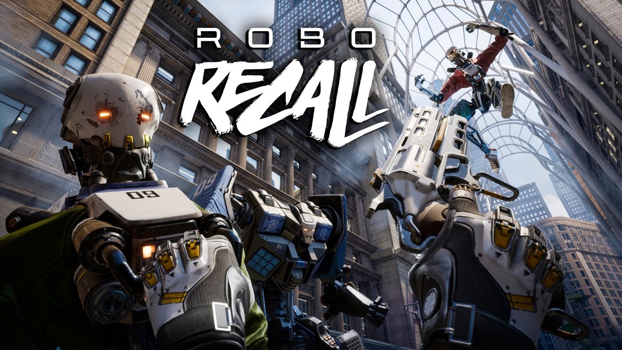
There’s still a huge amount of fun to be had though from games in a VR environment, particularly games that have been designed from the ground up to work in VR. Robo Recall for example is a title that you can download for free once you’ve registered your Touch controllers, and involves battling hordes of humanoid robots with a gun in each hand (although there are slightly more creative ways of defeating enemies, once you get to grips with the environment).
Overall I’ve been hugely impressed by the Rift so far, although it does still feel like a technology in its infancy, at least where the consumer market is concerned. Both of the currently available high-end VR systems, Oculus Rift and HTC Vive, require a fairly powerful PC to run. There’s also the need for the headset to be connected to the PC by a physical cable, which can get in the way when moving around the virtual space. One additional, and unexpected issue I’ve had, is interference with nearby wifi connections and bluetooth devices when the Rift is running. After some Googling it seems as though the USB 3 connections required for the Rift’s headset and sensors can actually emit interference at 2.4 GHz radio frequencies (see here, here and here for more information), so I have to remember to disconnect these cables when the Rift isn’t in use. Still, the Rift hardware is very well designed and the current bundle deal makes it that bit more accessible. I would expect Oculus to release a new improved iteration of their headset at some point in the near future, but for now I’m happy with the experiences the Rift provides.
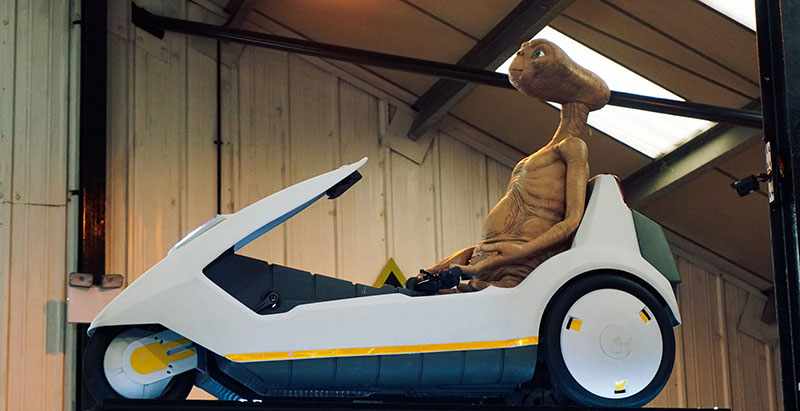
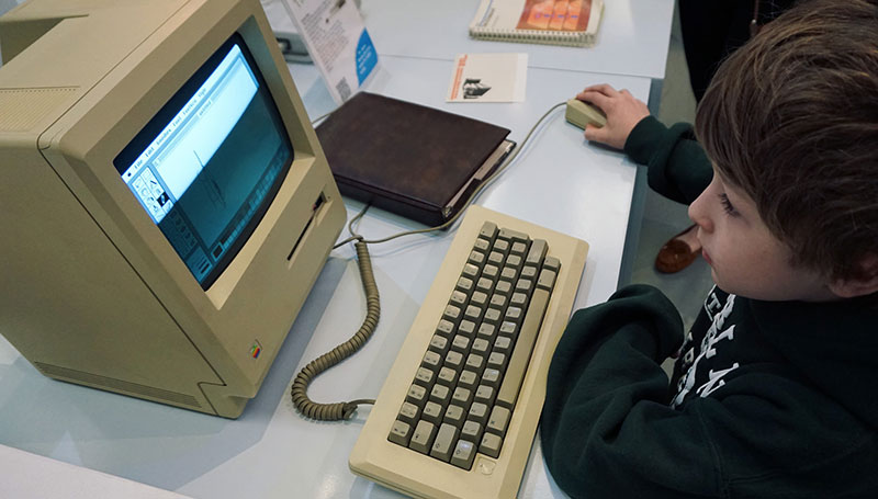
Nestled in a small, nondescript industrial estate in Cambridge is the Centre for Computing History, a museum of sorts with a large collection of vintage computers, games consoles, peripherals, ET riding a Sinclair C5 (obviously) and more. Much of the collection can be used by visitors. It was interesting to see my iPad-literate son playing with (or attempting to) the first ever Mac, although neither of my kids were as fascinated as I was with the collection of 80s video games. I have to admit, playing with an original and fully-functioning Grandstand Astro Wars unit gave me a bit of a Proustian rush and actually made me quite emotional.
There’s more than just nostalgia on display here though, the centre has four learning zones where visitors can get involved in exercises from composing computer based music, to controlling light systems with a Raspberry Pi.
As well as the regular, more permanent exhibits the Centre also hosts a number of events; Hackathons, gaming nights, and computing festivals. There’s a list of upcoming events here.
I was recently discussing/bemoaning the lack of a Windows version of Bohemian’s Sketch on Twitter, and @ryanAmurphy suggested I check out something called Figma. At first glance Figma appears to be essentially a clone of Sketch, and it certainly seems to sport a very similar UI and set of base tools. But Figma boasts a couple of key elements you won’t find in Sketch.
Firstly, not only does Figma run on Mac AND Windows, but because it can run in modern web browsers (it was built using the dynamic WebGL API) it can be used on a whole range of operating systems and devices. There are also native apps available to download for MacOS and Windows, although a quick look around in the desktop app suggests this is a product that was developed first and foremost for web browsers.
The second feature that gives Figma an edge over similar tools is something its creators call multiplayer editing – real-time collaborative editing for multiple designers. For this, Figma’s creators apparently took inspiration from multiplayer gaming, but looking at how it’s been implemented they seem to have also taken cues from existing collaborative apps like Google Docs and Hackpad. I’m not currently in a role where this type of functionality could really be used but based on past experience, I think multiplayer editing is something that could potentially be very useful in the right situation.
So far the pricing structure for the service (it’s definitely shaped more like a service than just an app) has yet to be announced, but up until the end of 2016 it’s completely free to use.
“Hunted and alone, a boy finds himself drawn into the centre of a dark project…”
That’s the mysterious description of developer Playdead’s latest game Inside, and it’s really the only information you’ll have to go on as the game begins. There are no cut scenes or introductions, there’s barely even a start menu. You take control of what appears to be a young boy (who is never given a name) making his way through a forest. The minimalist presentation is stunning, from the lighting to the sound design. The gameplay is simple but at times ingenious, and the character animation really helps give life to a character that’s never given much in the way of explicit exposition. It’s this deliberate paucity of detail though that serves to draw the player in, and there are various theories floating around on the Internet on what the game is about – particularly the ending, which without wanting to give anything away, is one of the most unsettling experiences I’ve ever had playing a game and will probably stay with me a while.
Inside feels like a natural progression from Playdead’s last game, Limbo. The production values have been ramped up and the gameplay is probably a bit more accessible (the puzzles seem a little easier here). Provided you can stomach the more grotesque elements (it has a PEGI rating of 18 and definitely isn’t a game you want to share with children) I can’t recommend Inside enough.